
Building a Brand with Heart and Halo
Cooper’s Ice Cream Crew is a nonprofit foundation created by friends in memory of their son, Cooper, The organization raises funds to support families and children facing medical crises.
I was honored to volunteer my time to the foundation and design its brand identity.
__________
VISUAL Identity
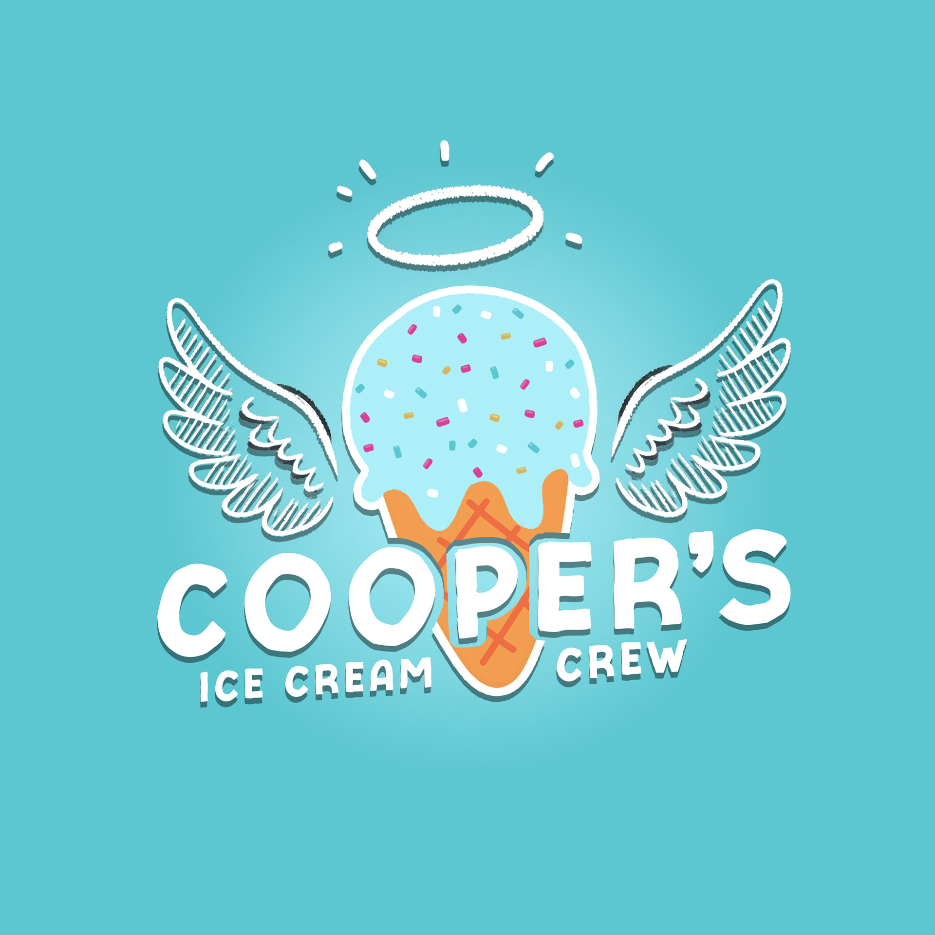
Primary Logo
The core logo features a hand-drawn ice cream cone with rainbow sprinkles, angel wings, and a halo—symbolizing Cooper’s memory and sweetness. Paired with a bold wordmark, it’s the foundation’s most recognizable emblem.
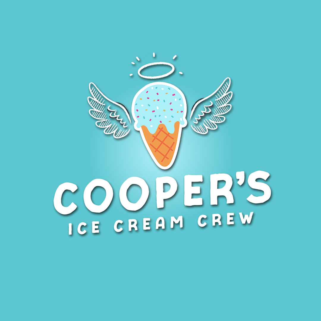
Secondary Logo
A cleaner variation with the visual icon floating above the wordmark, ideal for vertical layouts and print materials.
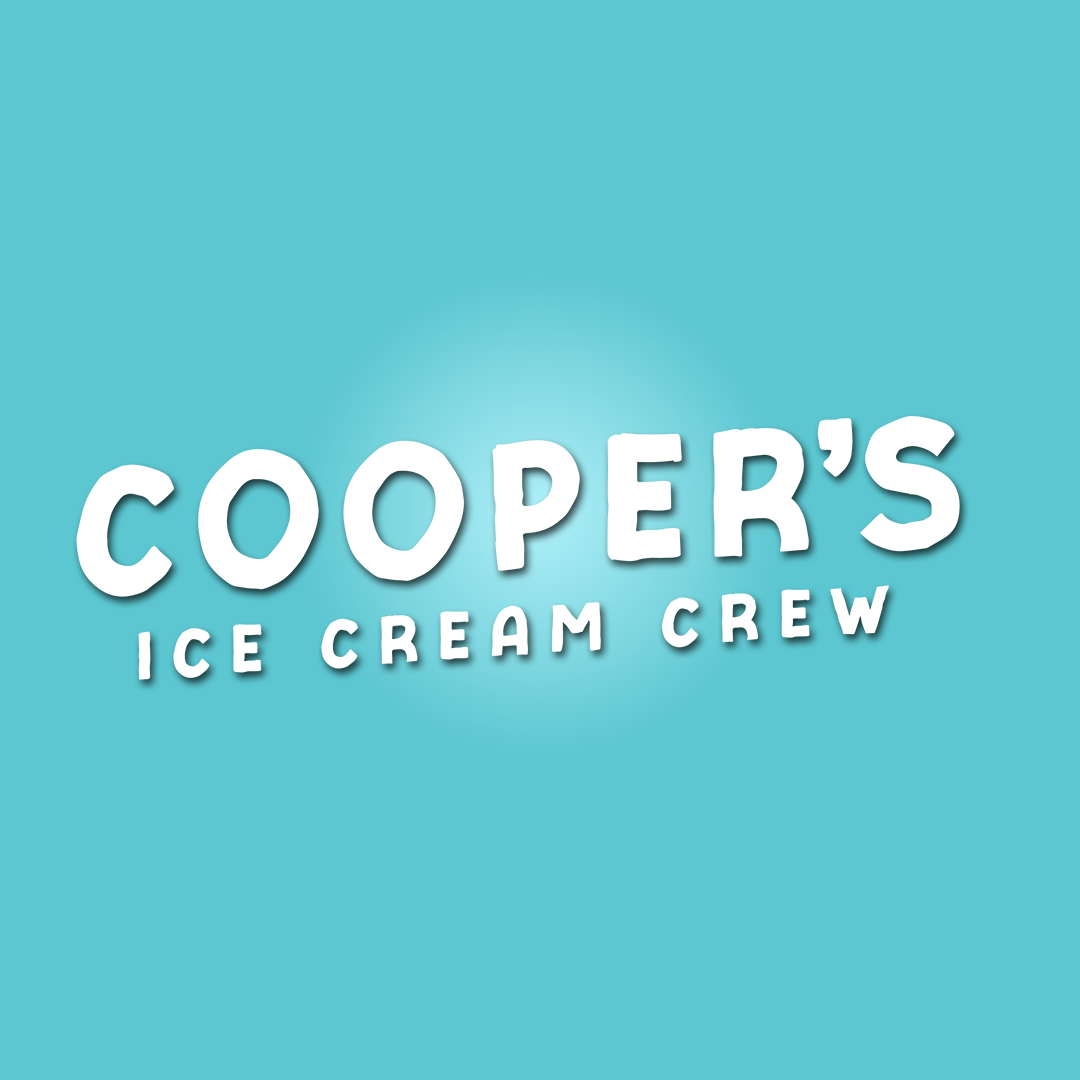
Isolated + Wordmark
The standalone icon is perfect for small-format use such as stickers, thumbnails, patches, and profile images.
A simple, impactful rendering of the foundation’s name, used where full imagery isn’t practical.

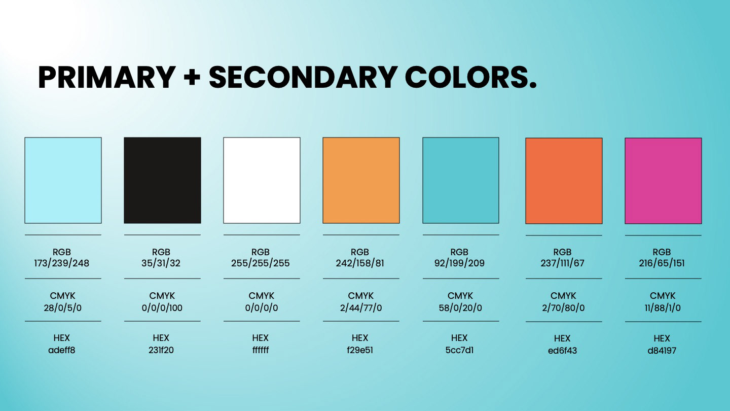
Color Palette
The palette blends gentle tones and emotional warmth:
• Baby Blue #adeff8 (primary)
• Black #231f20 and White #ffffff (supporting neutrals)
• Sprinkle Tones (for accent use):
• Orange #f29e51
• Blue #5cc7d1
• Dark Orange #ed6f43
• Magenta #d84197
These hues reflect the playfulness of the brand while offering versatility for both digital and printed formats.
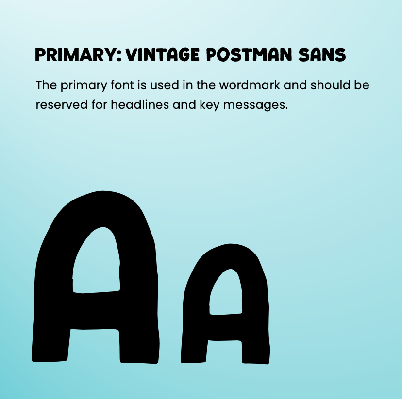
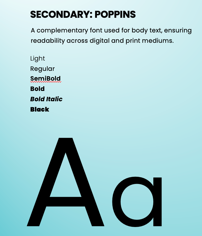
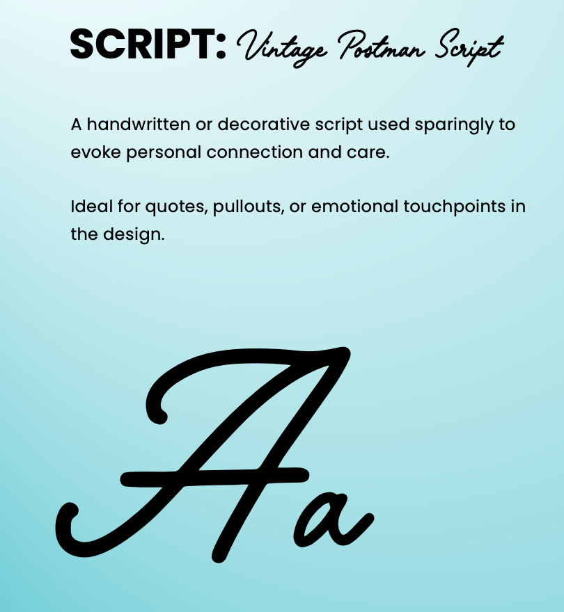
TYPOGRAPHY
Primary: Vintage Postman Sans – used for headlines and the wordmark, giving a nostalgic and welcoming vibe.
Secondary: Poppins – clean and highly legible for body text and paragraphs.
Script: Vintage Postman Script – used sparingly for emotional emphasis, handwritten quotes, and special messaging moments.
__________
Outcome
This branding system allows Cooper’s Ice Cream Crew to scale their impact while staying rooted in personal connection. Each asset was designed to help them fundraise, grow awareness, and spread Cooper’s legacy with heart and purpose.